> For a long time, I've wanted to integrate my blog with my web site and portfolio. I've finally accomplished it. Check out new posts, and my web site here.
Monday, February 6, 2017
Thursday, July 23, 2015
Gold Bolts
> Once upon a time, I was hired to design a student housing apartment complex sign. The direction I received was that they wanted it to be modern—but not too modern, simple, and they wanted it to be very legible (the previous sign had used a thick, heavy, black letter font that was far from easily readable). Other than that, they were open-minded.
> The client was a married couple who owned and managed the apartments. When I presented my designs, the wife was immediately drawn to one design (which was my favorite too—yay!). The husband looked them over for awhile, then pointed to the same one, saying something like, "I really like this one, but could we maybe add some gold bolts or something?" (internal gasp!) Doing that would go against their request for a modern, simple, legible sign, and besides that, I knew I'd hate it. We reviewed what they had asked for, what they wanted from the sign, then talked through what he hoped gold bolts would accomplish. Turns out he didn't want gold bolts, he was just looking for a way to make i feel heavier. I told them I could achieve what he was after, without adding hardware. I reworked and provided some alterations to their favorite design. In the end, simply making it a little bolder solved his concern. It was a good lesson for me in communication, and working with a client on making sure their needs and desires align, while also being true to what comes naturally to me.
> Fast-forward many years... Occasionally I'm contacted by a potential client who says, "I love your work..." then as he describes what he's looking for, all of a sudden I think, "He really wants gold bolts!" (I wonder what he saw in my portfolio that would make him think I could design "gold bolts"...).
> Thankfully, there are lots of styles, and lots of designers. I don't think there's anything wrong with saying, "I appreciate that you like my work, or... I'm grateful that so-and-so told you about me... But what you're asking for is really not something I specialize in. I think your money would be better spent with someone who does a really good job with "gold bolt" design."
> I don't like to turn down potential work, but honestly, I can't design in every style—and I really don't want any "gold bolts" in my portfolio anyway.
(click here to see an earlier post that mentions this project and includes an image).
(click here to see an earlier post that mentions this project and includes an image).
Thursday, March 5, 2015
Pretty, Old Things
> I love to look around in antique stores. I've posted a few times about things I've loved and purchased (printers blocks, printers type); and some I've loved but left behind (cool rusty metal thing).
> We did a bit of traveling around in the DC area last October, and in Lancaster County, PA, an antique mall was screaming out to me. Gene is a good sport and stopped.
> It didn't take long before he was going his own pace, looking at things that captured his interest, but it took a little while before I saw something that caught my eye, then, gasp! Look at this gorgeous book! I want it! (gulp! the price tag confirms I don't want it THAT bad!) It KILLS me when I find a one-of-a-kind treasure that is so amazing, but I can't justify the price (several hundred dollars in this case). The practical side of me confirms, "What would you do with it anyway?!" It was the most amazing family Bible, with a gorgeous embossed leather cover, complete with beautifully-scripted family genealogy in the first pages, as well as important, beautifully intricate documents tucked in the pages.
> I didn't have my camera with me, so I did the best I could with the not-so-great lighting and my camera phone. But even though the photos aren't great quality, looking at them makes me so glad I got to see and hold these special things. (Can you believe that intricate marriage certificate?? It looks like a handkerchief! If mine was beautiful like that, it would be framed on the wall instead of tucked in a manila folder in the filing cabinet...)
Monday, February 9, 2015
Save My Seat(s)
> By now you know I've got a little crush on a certain shade of green...but while I (surprisingly) don't have a lot of it throughout my house (my studio is a different story), I do add little pops of my favorite color here and there. For the most part, I reserve color for changeable accents—pillows, table decor, throws, etc.
> When I first got these stools, I loved the neutral tan fabric with the dark steel, but after several years of grandkids and everyday use, the discoloration and stains on the fabric were grossing me out. It was time for a little stool recovery—and some Pinterest inspiration showed me I could have "grandma-wrapped" plastic covered furniture, and have it still look cute.
> It took a little extra time because I chose a large repeating pattern, and being a bit of a perfectionist, I needed to make sure the patterns were centered. It wasn't difficult, it just took a little extra care when cutting, lining things up, and reassembling.
> Here are several pics of the stools before, the process, and the final photos of the finished stools.
A few tips:
- make sure you cut enough extra to wrap and securely fasten on the underside of the base
- iron your fabric after you cut it out
- the fabric store clerk will likely "fold" your plastic so it will fit in the bag, rolling it is better
- pull the fabric taut as you staple, but if you have a pattern, make sure the pattern isn't distorted as you pull and secure it
- notice where the mounting holes are in your base—if you have a geometric pattern, deliberately place your fabric according to how the base will mount onto the frame
- mark where the mounting holes are onto your fabric/plastic, or it will be hard to find them again!
> We are super excited with how these turned out. I can hardly wait for someone to spill on one of them.
Tuesday, January 27, 2015
DC Trip - Gettysburg
> Last October, Gene and I went to Washington DC. We were there for several days, and took the opportunity to not only see the city, but also explored sites all around us.
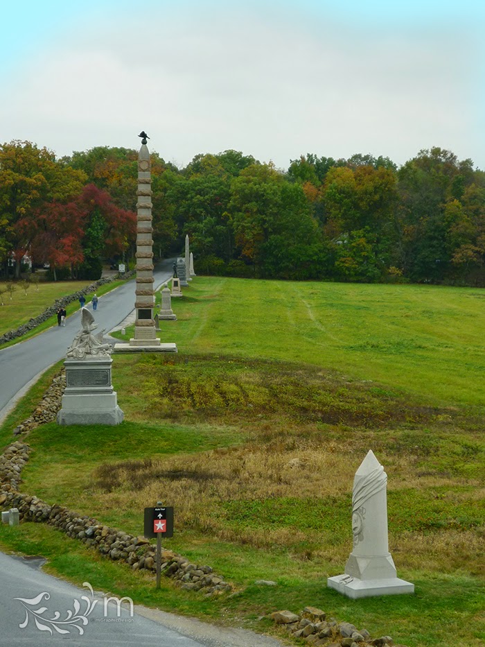
> One of those places was Gettysburg, PA. We drove about 2 hours from where we were staying, and even though it was a drizzly, overcast day, it was gorgeous. Gene had been to Gettysburg with his family many years before. His dad had hired a tour guide who they followed, and they would stop to learn about battles, people, and historic events that happened in specific places. We stopped at the visitors center gift shop, and bought a guidebook/map with a tour CD that led us to different locations where we could see the area and learn about the battles and monuments. We liked that we could spend as much or as little time as we wanted at each "programmed" stop on the tour. And we listened to interesting stories as we drove from place to place. We saw several people with actual guides, and we heard some neat stories while we were looking at sties at the same time. I think either way is a great way to experience the area.
> It's a beautiful place, and even though there were plenty of people everywhere, there was a feeling of reverence, quiet. There are lots of markers and monuments—all sizes, and all kinds—lining country roads, in fields, and on rolling hilltops EVERYwhere. It was overwhelming to think about how many battles were fought, and how many lives were lost in this beautiful countryside. I am grateful for those who kept historical records, who built monuments, and who passed down stories for those of us who have interest in learning about the sacrifices that were made then, so all of us can enjoy the freedom and blessings from living in this great nation.
> If you saw my earlier post about leaves, it was in Gettysburg that I found most of them.
> Gettysburg was one of many highlights of our trip. I found it to be beautiful, educational, humbling, and a great way to spend one of our days. Stay tuned for more highlights!
Wednesday, December 17, 2014
I Got Tagged
> It's that time of year...time when I get show off my promotional gift! From blog posts about other promotions (here, here, here, here, and here), you can probably tell, while I like my gifts to be a design piece, I also like them to be useful. And what's more useful at Christmastime than gift tags?
> The "do not open" one was in my head first, and as I designed it, I loved the way it worked out so well that I decided I wanted the whole set to be typographically playful, bold, and with numbers mixed in.
> I knew this was not one I wanted to put my logo on. But, I did want to have it branded in some way. I considered switching out the pine-green for "Maralee green", but it just didn't create the rustic Christmas feeling I was after. A little exploration led me to the idea of adding a little pop of my color on the corners, also creating the shape of a corner-cut tag—and it was just right.
> I wanted to use all the space on the front of the tag for my typographic message, so I included the "to" and "from" space on the back. And if I'm paying to print on the back anyway, I'm gonna take in one step further and get my money's worth! A custom pattern for each tag was added.
> Initially I had planned to string each of the tags, but as the end of the first week of December passed, and my workload pushed the promo assembly to after hours, I decided it would be okay to send them with "some assembly required". After all, we're used to that with Christmas gifts anyway, right?
> The feedback has been awesome. I've had a few people tell me they are only going to use them on immediate family, or not use them at all, so they can keep them (I want them to be used, but if they like them THAT much, I get it—and I'm happy and flattered). I had one client tell me I should market them...maybe I'll check into that for next year!
> My husband loved them too, so I adjusted the message of the card a little bit for a second version, and was able to use these for my personal greeting cards from us as well. Bonus!
>Now that I've finished assembling and sending them out, my after-hours can be spent getting ready for Christmas in other ways, like wrapping and tagging gifts! Whether you got tagged or not, I wish you Merry Christmas!
Thursday, October 30, 2014
I'm Different
> Most people have gone through times when they've felt like they were "different" and didn't fit in. When I was a little kid, I was uncomfortably aware of every little thing that made me feel different from other kids. The most obvious difference was my hair. I was one of 2 (maybe 3) redheads in my entire school. People made comments about my hair, but I never heard any comments about other kids' hair, so I knew mine set me apart. I always felt like I was wearing a big beacon on my head (more on that story).
> Thing is, in a successful business, being unique is a good thing. One of the important questions I ask my clients is, "What sets you apart? What makes you the better choice over your competition? What do you have to offer that they don't?" You want to be different—show off the figurative beacon on your head!
> I've decided to share my own company "beacons" here. To define my strengths, I like to compare myself against the common stereotypes about graphic designers:
- Procrastination I begin projects immediately, allowing the maximum time to develop then refine the best creative solution.
- Sloppy/Disorganized I thrive creatively when my work area is neat; and being organized is something on which I pride myself.
- "What's a deadline?" I don't miss deadlines. A project schedule ensures that the job is finished according to your needs. I'm an independent designer, so no one is making unrealistic promises on my behalf. I know what I can and can't do in a given amount of time. The agreement on a realistic timeline for the work is just as important to me as agreeing on the budget.
- "Hello, is anyone out there?" When you contact me, I respond promptly. Unless it's a weekend or holiday, you will never wait more than a day to get a response from me, (and it's usually within the hour).
- It only has to look good Quality is more than just great-looking design. Through communication, I make sure we both share the same vision so the finished product will be on target. If I've created something that I love, but you don't feel like it's right for your company, the job isn't finished. It's not successful if you don't like it. Of course if you request changes that will negatively impact what we're trying to achieve, I will give you my professional opinion, and will recommend other ways to accomplish what you want—in an appropriate, attractive way.
- Difficult to work with Things don't always go as planned, but I strive to make sure each project is a good experience. I see my clients as friends—it's easy to figure out how to resolve problems that arise when you're dealing with friends (I've been told by many clients how easy I am to work with. That's GREAT to hear).
- Glad that's over, gimme the money Obviously this is a business. I have valued experience, and put a lot of time and effort into my work, so I need a return on that investment; but repeat customers and word of mouth are very important to me. In my opinion, the end of a successful project happens when we both feel like we were treated fairly, with respect; when you walk away feeling like you got what you paid for, that you'd be happy to refer me, and work with me again; and I got paid for the work I provided, and look forward to hearing from you again when you have another project.
> Those "beacons" tell you how I work differently. Look at my portfolio and you'll see another really important beacon. There are lots of designers out there. We're all different, and that's a good thing. It makes it easier for the right client and the right designer to find each other.
Subscribe to:
Comments (Atom)


