Wednesday, December 28, 2011

Finding Peace During the Holidays

> I started my holiday promotional gift in the Fall, and it's a good thing! I knew it would take a long time, but I didn't realize just how long. Most were mailed a week before Christmas, which is really late for my "normal", but in all the feedback I got, no one complained about the timing (or about anything else—yay!) 
> Here are several photos of the process of making the wood block perpetual calendars.


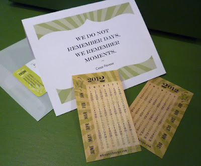
> I made 50 of the production-heavy wood block calendars, but that quantity didn't come close to how many people I enjoy send promotions to, so I needed to come up with an alternate. I was so excited when I found a vendor who prints on thin sheets of wood. I designed a business card sized calendar, and placed my order. Everyone got an mGraphicDesign custom calendar, on wood. Happiness! And now that they're finished, peace.

Wednesday, December 7, 2011

Branding It All

> I just received the printed pieces for some of my holiday promotion recipients. Ever since I got the proof in the mail a couple weeks ago, I was SO excited. They're cards—printed on thin wood. And they look fantastic!
> I'll share pics of the actual pieces soon. (I want the recipients to have them in their hands before they see them here) You'll have to wait a little longer!
> The thing I want to share here is this company's brand. Every email I get, whether it's a sales promotion, or the response from a customer service rep; even down to their packing tape is branded thoroughly. Not just logos all over the place—that's not a brand—but a true extension...what the world would look like if they had created everything in it...the language, the expressions, even the name of the state they're located in. I just love it. This is a company who "gets" what branding is "owl" about.

> And the quality of their products is something else for them to be proud of. Check them out: Night Owl Paper Goods.

Friday, November 18, 2011

It Wanted to be Green

> Not too long ago, I posted an in-progress photo of the perpetual block calendars I'm making for my holiday promotion. At the time, I wanted to let them be "natural"—letting the wood show through, and using natural earthy colors. 
> And they were okay, but they were just "there". They needed some pop! I tested out a few color combinations and taped the colored squares onto the blocks. Wow...hands down, the green looked the best. I admit I'm biased, so without saying anything, I took the color combos to my husband and asked his opinion. And guess what, he chose the green! Now, he knows I have an obsession with a certain shade of green...so you might think he's an unfair judge, but if he thought one of the other colors looked better, he'd have told me so. I promise!
> Here's an updated look at the blocks. See? Don't you agree the green is so much better than the natural wood? 
> Because this gift promotion is so labor-intensive, I'm only making a small number of this type of calendar, and I have a super-cool alternative that I'm sending to the rest of my client/vendor/friend list. 
> I've got one more step in the process, then I'm going to post with photos of the whole process, so once again, this is just a teaser...stay tuned!

Wednesday, October 26, 2011

It's a Flyer...or is it a Flier?

> I'm working on an invoice for a client. I created 2 email flyers (or is it fliers?) Seems like it's one of the more inconsistently-spelled words I come across. I've got a client whose been in advertising and marketing for more years than I've been in design, and he spells it "flier". Others I have worked with insist it's spelled  "flyer". 
> To me, it seems like "flyer" is better. Why? Well, if you fly a lot, you are a  frequent "flier"—right? So if "flier" is the correct spelling in that instance, then the spelling "flyer" seems more appropriate for a very different use of the word—such as a single page design which communicates an event, service, product, or activity. Without using any style guide or dictionary, that's just what seems right to me.
> Hoever logical my own reasoning is (you agree, right?), apparently both are technically correct. I ran across this article that gives credence to both. What do you prefer?

Monday, October 17, 2011

Very New, and Revitalized Old Type

> Ask anyone I've been with in an antique shop...I'm obsessed with wood block printer's type. Even though I don't even have space to properly display my current collection, I can't pass it up when I find it! In fact, when I realized how much I had spent on my collection, the practical side of me banned the impulsive side of me from even getting on ebay anymore (turns out when you "win" an auction, it just means that you are the one who was willing to pay the most $ for something). You see, I could easily justify my purchases with the fact that once it's gone, it's gone! It's not like anyone's making new wood block type. Duh! 
> Well, my justification/excuse (call it what you will) is now gone! Someone IS making new woodblock fonts! Revitalizing old fonts, creating entire sets, in multiple sizes, and making them available for purchase. I still love the discolored letters that were used for years, but it makes me feel less desperate knowing that there will be more, when my practical side loses out to the ebay winner in me.

Thursday, October 6, 2011

Beginning to Look A Lot Like Christmas...

> I learned a long time ago to start on my holiday promotion a couple months before Christmas. It's easier to squeeze time in between actual work projects to get it finished if I don't leave it to the last minute.
> You should know that while I love the holidays, I'm one of those people who finds it ridiculous that we are still weeks away from Halloween, and yet most retail stores have already decked their halls with Christmas! So, despite knowing I need to start thinking about Christmas early (where my clients are concerned), it still seems "wrong" to be working on Christmas gifts. However, today turned out to be a good day to start working on the assembly. A cold front came through, and since my home office sits at the mouth of a canyon, with a little higher elevation, it snowed today! Now, typically I'm not a fan of the snow. It's pretty, but I don't like being cold, or wet—I don't like scraping it off my car windows, I don't like bundling up, and I don't like walking or driving in it. It's just pretty to look at—that's it. But today, well, as a backdrop for working on Christmas gifts, well, it was fitting (and then it melted...perfect!)

Wednesday, September 21, 2011

Inspired by...Better After

> I think I've mentioned before how much I LOVE before and afters. I recently discovered a blog that feeds my obsession...Better After.
> Featuring everything from furniture to rooms, to home exteriors, it's a great resource—whether it's ideas for your own projects, to simply being wowed with the results of the vision and efforts of others—this is one of my favorite blog reads.
> If you're a fan of makeovers, you will love this blog.

Saturday, September 10, 2011

Good Thinking

> Where do you do your best thinking? Have you ever thought about it? 
> When I was in college, I learned that focusing on something OTHER than what I was trying to solve was the answer to solving creative challenges. 
> I had a creative writing class, and I had been struggling with an assignment. I just couldn't come up with anything that I was happy with. I gave up for the time being, not because I knew it would help me focus, but because I just wasn't getting anywhere with it. We didn't have a dishwasher, and anyone who knows me, knows that dirty dishes in the sink or especially on the counter are a huge pet peeve. They call to me and won't leave me alone til they are cleaned and put away. So, later that day when I had my hands in the hot sudsy water, the solution to my creative writing class just came to me! I was so excited! I have also realized that I have a lot of "creative breakthroughs" while in the shower (what is it with me and warm water??) Anyway, a lot of times, when a solution just isn't coming to me, I try to take a break. I've found that when I get away from the blank monitor, or the empty notebook page—the pressure to create is gone, and my imagination is free to do what it does best, in the way it's most effective.
> What about you? Have you figured out where and how you do your best thinking?

Monday, August 29, 2011

Numbers Count

> We recently had the stucco redone on our house. We were so excited about the results—the newness, no cracks or stains, and the new warmer color—we decided we just couldn't re-hang the house numbers that had once been there. They were cheap, plastic, and from my point of view, just plain ugly. My husband and I agreed that we needed better looking numbers to adorn our face-lifted house.
> In hindsight, I wish that I had taken a photo of the "before" numbers, but I hastily threw them out as soon as we decided we weren't going to use them.
> With expenses and the economy as they are right now, we needed to be frugal as well as finicky, which narrowed our selection quite a bit. 
> We found some in an art deco font that we LOVED, but they just didn't fit well on the plaque we needed to use. Our second choice was a condensed roman (serif) font, but it was SO condensed that we decided it wouldn't be as legible from the street as we felt like it should be. We purchased our third choice—it's a hybrid between a serif and sans serif, giving it a modern feel. Some of the numbers are shown above. We plan to get the numbers mounted and the plaque hung this evening. 
> For someone who's not a numbers person, I'm pretty excited about these!

Thursday, August 18, 2011

Vegas from a Different View

> I was in Vegas last week for a family reunion. I've been there numerous times, but this time, we did some activities I haven't done before...like Hoover Dam, or hiking in Mt. Charleston, and the only money I put into machines was at the Pinball Museum.
> I spent one day with my husband, and my sis and her husband, and we checked out some of the places on the Strip we hadn't been to before—like the City Center with its cool modern architecture, lots of glass, and unexpected angles. When we were in places I've been before, I tried to notice things I hadn't seen before (A little tough to do since everything there is loudly fighting for your attention).
> Here are a few shots of some of the things that I narrowed my focus on...a patterned tile floor...a merchant's decorative front window glass...and the covering of the Paris hotel's valet area.
> I feel pretty good about successfully looking past all the lights and glam, and finding some great details that I had missed during previous visits.


Wednesday, August 3, 2011

Here Kitty Kitty...

> One of the blogs I get regular feeds to is called Freelance Switch. Great articles and great ideas, tailored to freelancers, like me. The article today is about the health benefits of having pets, especially for freelancers. Good news for me, I work alone and I've got 2 cats (Ninja and Dorian Gray). It's a great article with research to back up the theories. There's a study on a group of stockbrokers who all suffered from hypertension. They sent half home with medication, and the other half home with a dog or cat. Guess which group had a noticeably lower stress level? Yep—the animal people.
> I should get double the benefits from having 2 cats...but I'm not sure since cats are pretty finicky...they say who, and they say when! Still, I put up with the hair everywhere, and having to clean the littler boxes...they're part of the family. They get spoiled with kitty treats and toy mice...they must be doing their jobs right.

Wednesday, July 20, 2011

Fascinated by Failure

> Well, actually this blog title is a little misleading... I'm not saying I'm interested in failing, quite the opposite. However, over the years, as I've given many many options to clients, there are times when my favorite solutions are chosen, and times when I'm surprised by the selection they make. I wonder about the creations that weren't chosen. Is it simply a matter of personal preference? Was it a typeface or a color that turned them off to the whole approach? Or did I simply fail to create a design that communicated their needs in a visual way?
> I have thought many times about putting together a promotion that highlights some of the "rejects" that I really like and think would have been great if chosen. I wonder though...do I need the client's permission to use them? I mean, if they said no to these designs and they're not being used, does it matter? Of course if it's a logo, it has their company name, so maybe it's just respectful to ask...but if I ask, will they question why I'm featuring a design they didn't choose? Why didn't I push harder for them to choose what I may have felt was a stronger solution?
> Maybe I'll just include the "losers" along with the winners in blog posts, and let my readers be the silent judges of the appropriate solution. Thoughts?

Tuesday, July 12, 2011

Specialty Techniques Done Right


> A few months ago, I shared my love of the blog Bakerella, and now I have reason to send you there again. She recently blogged about a cupcake bakery she had visited called "miette". Next time I go to San Francisco, I am definitely going, and I plan to walk out at least 10 pounds heavier! 
> Of all the delicious treats featured in the blog, my favorite was a photograph of their recently released self-titled cookbook. I LOVE the scalloped pages! What an appropriate and creative special effect. 
> When it comes to special effects in printing, if you're going to spend a little extra money on the production, make it complementary to your company's brand and visual message. For example: if your company's main selling point is that you offer the lowest prices, a metallic foil stamp is not the message that shows your clients that you know how to save money. And if you are a financial investor for wealthy clients, you shouldn't print your own cards from a template file onto flimsy perforated paper stock.

Wednesday, July 6, 2011

Confidence at the Chalkboard


> You know how some people are intimidated to write on a chalkboard? Their writing gets larger or smaller as they begin to write, or they start writing up or downhill? I've always done okay at the board—my writing stays pretty steady, and I'm right-handed, so I don't have a problem smearing it as I go along. 
> I ran across this typographic designer, Dana Tanamachi, who brings a whole new level of inadequacy for anyone like me who once felt confidence with chalk. She works for Louise Fili (big surprise, a typographic design legend!) 
> If I could even do with a pencil what she does with chalk on a chalkboard, well, let's say the term "big head" would be an understatement. I am SO in awe. She's got a web site with lots of amazing samples of her work including a few time-lapse videos, do yourself a favor and take a look.

Wednesday, June 8, 2011

Food Buddies


> I'm a fan of creativity wherever I find it. In this case, it was a couple years ago—I was in one of the shops at Gardner Historic Village in West Jordan, Utah. I took these pics with my handy iPhone camera, but they quickly got buried among many others. I just ran across them again and decided to share.
> Now I wish I had bought a pair. Who knew veggies could be so sweet and endearing?

Thursday, June 2, 2011

Inspired by...Humor

> Do you ever wonder about the people who live in the catalogs you get in the mail—you know, Pottery Barn, Crate & Barrel, Design Within Reach? I love looking at the wonderfully art-directed rooms and have wanted to live in some of those pages myself. Turns out, there's a blog devoted to those catalog people...meet Gary and Elaine, and get a glimpse every day of their bizarre and hilarious relationship and life. 
> I follow a lot of blogs, (thank you Google Reader for making it easy to keep track!) and Catalog Living is so clever, witty, and only takes a second to read, so while some stack up until I have time to catch up, this is one that I HAVE to read every day. I get to look at all the great stuff in the catalogs I love, but with the addition of a witty caption.
> Written by actor, writer and comedian (for sure!) Molly Erdman, I highly recommend taking a look at this blog. It's worth it, and if you won't take my word for it, how about this—there is enough of a following that a Catalog Living book is now in the works.

Thursday, May 19, 2011

Typography at Home

> Recently, I was looking around in a furniture store, and found some great items using typography as the main design element. Love the canvas fabric, the colors, the rustic feel—my poor husband still hasn't gotten used to me taking pictures of random things...but it had to be done!


Wednesday, May 4, 2011

Better Bar Code

> Who says everything HAS to be done a certain way? I love the creativity applied to every detail of this product packaging, even down to the required bar code (barn code). More important that simply being creative, it's applicable to the product line (turkey sausage).

Monday, April 18, 2011

Misspellings

> Over the years, I've come to the conclusion that either a person has a knack for spelling or they don't. I LOVE spelling. One of my college roommates figured this out right away, and for years after college, I'd receive phone calls from her, asking how to spell some word (yes, I've dated myself...this was before the Internet became the tool that it is. In fact, now that I think about it, the Internet may have become popular about the same time she stopped calling me for how to spell words! Hmm...)
> Anyway, a couple of weeks ago, I received a resume from a soon-to-be college graduate. Even though I currently have no need for employees, I still like to look at resumes and portfolios that come my way. Occasionally, I have colleagues who are looking for designers--and you never know. So I read through it, and found several typos—eek! But it happens. In fact, one of my vendors pointed out one in my own email newsletter last month, and my mom has pointed out a couple in my blog postings (I get a little weak in the knees when I realize my carelessness!) However, in a resume? That CAN'T happen!
> So, while I couldn't give her a recommendation, pass her resume on to someone else, or even keep it on file for possible help in the future, I thought I would give her a little help in editing. You know, give her a better chance with the next resume she sent out. I sent her a carefully-worded email and pointed out the errors: You're pursuing, not pursing. It's an internship, not an interne ship. And the scariest for me as a designer: they're brochures. Not broachers. 
> I received a very nice email in return, thanking me for the time I spent, and for noticing some missed spell words (well, I tried!)

Color & Patterns


> I love these bracelets! The rich, earthy colors; the variety of patterns, I love the combination of all of them together (except that fuschia one near the left—nothing against the color itself, I just think it sticks out with the others. And not in the good way.
> Still, I love them. Keeping the pic in my inspiration folder—have to figure out a project using geometric patterns together—kind of like a quilt. They're handmade in Colombia, available here.

Friday, April 15, 2011

Typographic Tile

> This past week I was on vacation, visiting family in Texas. We went hiking on Enchanted Rock (really cool!) Afterwards, we had lunch on the patio of a German cafe, then strolled down the main street in Fredericksburg. Lots of antique stores and shops—a great way to spend the afternoon.
> As we were walking, I had to stop and take a picture of this awesome tile entryway. I always get strange looks when I take photos like this, but seriously, who can't appreciate how cool this is!

Thursday, March 24, 2011

Inspired By...Lovely Packaging

[ I follow several blogs on a regular basis. Here's another one that inspires me. Hope you enjoy it too ].

One of my favorite blogs to spend way too much time on is lovely package. And lovely it is. Regular updates with wonderful photos of amazing, innovative, creative, tasteful packaging designs. A great resource for inspiration for any design project.

Wednesday, March 9, 2011

Featuring Features


> I'm currently working on a brand for a company whose target audience includes wealthy individuals or companies. So, I discussed doing some things that communicate a message of refinement, taste, and the ability to use money wisely without going overboard on flamboyance.
> There are several collateral items in the works, but business cards needed to happen first.
> We considered several print techniques, but eventually landed on using a heavier duplex stock with a ribbed texture on one side. A silver metallic ink was used to print information on the dark navy side of the paper—enough contrast to be readable, but also to bring in the richness of silver, which also ties into the company name, also printed in silver, but with a raised technique to make it pop off the card and give an additional textural quality. And the best part: the logo is not only printed but embossed, with an intentional "empty" space on the back of the card. The embossing job was done so well, that even with the fine detail, it almost appears to be a debossed logo when you're looking at the back of the card.
> A lot of special techniques, but done in just the right amounts so rather than being overboard, it's a complementary grouping of features that helps to communicate money spent, but responsibly. The right message to send to their own clients.

Wednesday, March 2, 2011

Thinking on Paper

> When I was taking my first design classes in college, computers weren't associated with the "art" building (yes, I'm dating myself here). We all had sketchbooks that were full of ideas, concepts, doodles, drawings, and with the beginning of any project, the thinking started on paper. By the time I finished school and had my degree, designers were starting to incorporate computers as production tools, but only for technical things. Designers were still working out concepts and designs on paper before ever taking them digital.
> I was talking to a friend the other day. He's a professor and teaches design courses at a nearby university. We were laughing about how his students give him quizzical looks when he mentions the term "sketchbook", or mentions working out concepts on paper first, rather than just starting on the computer.
> Occasionally I'll start my designs on the computer - depends on what type of project I'm working on, but I feel more comfortable if I have several sketches that I've worked up on paper first. I think better on paper! I can get out more ideas, and get a sense if they're feasible more quickly when I start with sketches.
> I'm sure the "new" designers who don't know anything different, do their best thinking on the computer, but for me, I'm glad I was on the bridge between both traditional and digital design. I can pick and choose between whatever technique and tool is going to produce the best results.

Thursday, February 17, 2011

Getting More Work

> Since I run my own business, I do lots of reading to educate myself on how to improve the way I do things. Freelance Switch has been a great resource for me. I really enjoy getting their daily blog links. One that came yesterday, by Susan Johnston, gives 110 ideas on getting more work. I read through them, and was pleased to find that I already do several of them, such as asking for testimonials (click the links on my client list to see some that I've gotten); I send out a monthly email newsletter; and I always send out at least one holiday promotion each year, as well as do several other things from their list.
> There are lots of other great ideas in their blog article, even specific ideas depending on whether you are a writer, programmer, designer, illustrator, etc. I got some good ideas about working with local businesses since all my work seems to be non-local.
> And it's good to be reminded that even though I'm doing good things to promote myself, there's always more that can be done.

Friday, February 11, 2011

Inspired By...Bakerella

[ I follow several blogs on a regular basis. Here's another one that inspires me. Hope you enjoy it too ].


> I have come to love valentine's day. No, I've never been one of those ladies who gets showered with gifts that are somehow intended to prove love and affection, and that's not why I love valentines day anyway. It's because there are some really delicious goodies for women who love decadent sweets! And if I get a box of yummy chocolates, no one expects me to share! 
> I've always had a sweet-tooth. Some people keep a stash of goodies so they always have something on hand...I would love to have a stash, I just can't seem to keep one!
> I'm not even sure how I came across this blog because I don't really spend that much time in the kitchen, (I enjoy baking, but just the easy stuff: cookies, cake, nothing really worth photographing!) but this blogs is definitely one of my favorites. Bakerella (how much do you love the name?) was created by Angie Dudley, a baker from Atlanta, GA. (wish I had known about her when I lived there!) She writes regular posts on her blog, showing off her amazing creations. Everything is delicious, from the photography, the creativity, the writing—and her personality is absolutely charming. The best part, she includes step by step photo-laden instructions on how to make everything! 
> If any of you is inspired to try any of these creations and needs a taste-tester, just let me know, I'm there!
(photo from the Bakerella.com blog)

Tuesday, February 8, 2011

Simple Creativity

> When I was in grade school, I LOVED when the "BookMobile" came! When I mentioned this to a friend years ago, he had a good laugh because he knew I didn't care about reading (I've since discovered that I just needed to find things I enjoyed reading, now I LOVE to read!) But at the time, he asked what I possibly liked about having a rolling library come, since I didn't like to read. Well, without fail, I would look for one of the "Harold and the Purple Crayon" books (by Crockett Johnson). I loved those books!
> The thing I still love about those books is that they represent creativity in its simplest form. A great concept, illustrated in the most simple but direct way of communicating that concept. A little boy who goes on adventures based on what his own crayon draws—and it's illustrated with line art, using flat colors. Imagination and execution. It inspired me then, without really understanding why; and simple solutions based on great concepts are still the things I'm inspired by the most. 

Wednesday, January 19, 2011

Inspired By...

[ I follow several blogs on a regular basis. There's something about each of them that inspires me. I decided to start sharing them with you, along with what I love most about them. Maybe they will become your regular faves too ].


> I've been struggling with migraines for the past several days. Usually I can power through and keep going, but after a long run, I get weary and I start dragging more. I was feeling a little better yesterday, but didn't realize how much til my husband got home, and I shared some recent good news: "One of my clients told me that if I want to purchase new fonts for their projects, that they would approve them and include it in my budget!" He laughed and told me he could tell I was feeling better.
> Doesn't he know that getting new fonts, especially when I get to choose them, but someone else pays for them ALWAYS makes things better??
> Yes, fonts inspire me. Which is why I love the idea of this blog. Each day, designer/illustrator Jessica Hische, features a different block cap letter. And she also shares the html code that allows people to use her designed letters on their own blogs. Nice!

Thursday, January 13, 2011

Keep in Touch

> This week I'm working a couple of projects for a client—designing feature articles for a scrapbook magazine. Over the past 6 months, they've become one of my more regular clients, which honestly, is a real blessing in a business climate where work from more regular sources has been decreasing. I was thinking about this the other day, and about how my relationship with them started.
> In 1991, I got a job working for WordPerfect (remember them?) I started out as a production designer, then moved up to a position where I was working on designing international fonts. What does this have to do with scrapbooking, or magazine design? Not much (except one little detail that became the key to years worth of work). We were a small team, so we became pretty good friends. When WordPerfect and Novell merged, we were all laid off. My team leader went to work with a start-up magazine, and was with the company as it grew and expanded into related markets. And we stayed in touch.
> Several years later, I got a call from this friend after he received the holiday promotion I sent to him, and a handful of contacts, trying to drum up more work. He was in a senior creative position, and hired me to do a couple of freelance projects. Those projects turned into regular work that doubled my income for the next 3 years. Unfortunately, internal corporate changes took all the freelance design work back to their in-house creative team. I continued to send my monthly email newsletters, and annual holiday promotions, hoping to break in again.
> About a year ago, my monthly email newsletter was returned, saying my friend was no longer with the company (I still don't know where he went or what happened—gotta work on that!) Luckily, I was able to find out who had taken his position, and because of the work I had previously done for the company, I had a foot in the door. The rest was up to me—using my creativity, skills, and work ethic to show them what I could offer. I've been able to do several projects for them in the past several months, and hopefully am building a new business relationship that will provide me with continued work in the future. But it all started with a co-worker, in a less-than-creative job.
> The point? Keep in touch. You never know which relationships are going to one day turn into something really rewarding.

Wednesday, January 12, 2011

Turn it Up!

> Do you listen to music when you work? Does it help you think? Does it make you more productive? Or does it hamper your creativity or your thinking?
> I took lots of art and drawing classes in college, but I specifically remember one day in a head/face-drawing class. It was an informal setting—we drew from a live model, and while we usually concentrated on what we were doing, we could chat, or take short breaks to get up and walk around. Someone had brought in some music, and we were all enjoying it. The professor, who usually sat and drew along with us, was discussing that music was distracting from the thinking process. He argued that while you're listening, you often hum or sing along (either out loud or in your own mind), and that your brain is using it's power of recall to do that. So if your brain is multi-tasking—thinking of lyrics or a melody, as well as trying to come up with a creative concept, or concentrating on your project—your capacity to be creative, or effective is reduced.
> On one hand, I agree that he's on to something. But on the other hand, I know from years of experience, that music has often been helpful to my creative process. At times, listening to my favorite music makes creative thinking more effortless. And time passes by more quickly when I'm burdened with repetitive production tasks. Now, if I'm writing, or working on a proposal, I typically turn off the music, I find it distracting. But creativity? Music turns it up a notch for me. What about you?