Wednesday, July 20, 2011

Fascinated by Failure

> Well, actually this blog title is a little misleading... I'm not saying I'm interested in failing, quite the opposite. However, over the years, as I've given many many options to clients, there are times when my favorite solutions are chosen, and times when I'm surprised by the selection they make. I wonder about the creations that weren't chosen. Is it simply a matter of personal preference? Was it a typeface or a color that turned them off to the whole approach? Or did I simply fail to create a design that communicated their needs in a visual way?
> I have thought many times about putting together a promotion that highlights some of the "rejects" that I really like and think would have been great if chosen. I wonder though...do I need the client's permission to use them? I mean, if they said no to these designs and they're not being used, does it matter? Of course if it's a logo, it has their company name, so maybe it's just respectful to ask...but if I ask, will they question why I'm featuring a design they didn't choose? Why didn't I push harder for them to choose what I may have felt was a stronger solution?
> Maybe I'll just include the "losers" along with the winners in blog posts, and let my readers be the silent judges of the appropriate solution. Thoughts?

Tuesday, July 12, 2011

Specialty Techniques Done Right


> A few months ago, I shared my love of the blog Bakerella, and now I have reason to send you there again. She recently blogged about a cupcake bakery she had visited called "miette". Next time I go to San Francisco, I am definitely going, and I plan to walk out at least 10 pounds heavier! 
> Of all the delicious treats featured in the blog, my favorite was a photograph of their recently released self-titled cookbook. I LOVE the scalloped pages! What an appropriate and creative special effect. 
> When it comes to special effects in printing, if you're going to spend a little extra money on the production, make it complementary to your company's brand and visual message. For example: if your company's main selling point is that you offer the lowest prices, a metallic foil stamp is not the message that shows your clients that you know how to save money. And if you are a financial investor for wealthy clients, you shouldn't print your own cards from a template file onto flimsy perforated paper stock.

Wednesday, July 6, 2011

Confidence at the Chalkboard


> You know how some people are intimidated to write on a chalkboard? Their writing gets larger or smaller as they begin to write, or they start writing up or downhill? I've always done okay at the board—my writing stays pretty steady, and I'm right-handed, so I don't have a problem smearing it as I go along. 
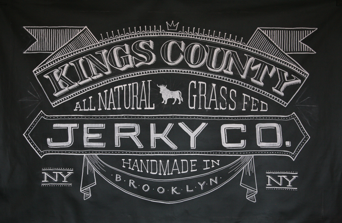
> I ran across this typographic designer, Dana Tanamachi, who brings a whole new level of inadequacy for anyone like me who once felt confidence with chalk. She works for Louise Fili (big surprise, a typographic design legend!) 
> If I could even do with a pencil what she does with chalk on a chalkboard, well, let's say the term "big head" would be an understatement. I am SO in awe. She's got a web site with lots of amazing samples of her work including a few time-lapse videos, do yourself a favor and take a look.

Wednesday, June 8, 2011

Food Buddies


> I'm a fan of creativity wherever I find it. In this case, it was a couple years ago—I was in one of the shops at Gardner Historic Village in West Jordan, Utah. I took these pics with my handy iPhone camera, but they quickly got buried among many others. I just ran across them again and decided to share.
> Now I wish I had bought a pair. Who knew veggies could be so sweet and endearing?

Thursday, June 2, 2011

Inspired by...Humor

> Do you ever wonder about the people who live in the catalogs you get in the mail—you know, Pottery Barn, Crate & Barrel, Design Within Reach? I love looking at the wonderfully art-directed rooms and have wanted to live in some of those pages myself. Turns out, there's a blog devoted to those catalog people...meet Gary and Elaine, and get a glimpse every day of their bizarre and hilarious relationship and life. 
> I follow a lot of blogs, (thank you Google Reader for making it easy to keep track!) and Catalog Living is so clever, witty, and only takes a second to read, so while some stack up until I have time to catch up, this is one that I HAVE to read every day. I get to look at all the great stuff in the catalogs I love, but with the addition of a witty caption.
> Written by actor, writer and comedian (for sure!) Molly Erdman, I highly recommend taking a look at this blog. It's worth it, and if you won't take my word for it, how about this—there is enough of a following that a Catalog Living book is now in the works.

Thursday, May 19, 2011

Typography at Home

> Recently, I was looking around in a furniture store, and found some great items using typography as the main design element. Love the canvas fabric, the colors, the rustic feel—my poor husband still hasn't gotten used to me taking pictures of random things...but it had to be done!


Wednesday, May 4, 2011

Better Bar Code

> Who says everything HAS to be done a certain way? I love the creativity applied to every detail of this product packaging, even down to the required bar code (barn code). More important that simply being creative, it's applicable to the product line (turkey sausage).