Tuesday, December 14, 2010

May your Goals Become Reality


> There's a quotation that says (basically): "Written goals have a way of transforming thinking. Turning can't into cans; dreams into plans; and plans into reality." I like the message. It emphasizes the fact that you have the ability to change your own reality, but it requires effort on your part.
> At this time of year, people start to think about the coming year, and about "resolutions" they will make on New Years Day. I've never been a big believer of making resolutions...but goals are a different thing. I found an article that does a good job of summing up how I feel.
> As you may know, each year, I design and create a promotional gift that I send out as a thank you to clients, vendors, friends and supporters of my business. This year, I designed 2 notepads because people make goals and/or resolutions around this time of year, so I'm giving them a place to jot down their ideas and notes, and another place to write down their goals and the steps they need to take to achieve them.
> I chose to not include my name or logo on them—but of course one is "maralee-green", and with typography as the main design element, they visually "say" they're a holiday wish from me.
Monday, December 13, 2010

Low-Price Leader?

> I recently put a design proposal together for a potential new client. I've got enough history that I know what a realistic time frame, and realistic costs are for certain projects. The would-be client came back saying he really wanted to work with me, but he had a proposal from another designer for a fraction of my price, under the same constrained timeline, and he wondered why mine was so much higher.
> I told him I could only account for my own price based on the information he had provided me. If someone was coming in THAT much lower, I suspect it was someone without the experience to know how much time would be required, or someone who was not very good and felt a like a low price would get him the project, or possibly a skilled person who was qualified, but very desperate for work. I suppose it could have a been the latter, but the odds are against it. 
> I've seen the other design projects this company has had done—it's good stuff! And I know with his last project, they went way past the deadline in order to make him happy. My experience tells me that by choosing to hire this other designer, he will run into a problem: he won't meet his deadline, or he will find out that the bid didn't include things that he thought were part of the job, or he won't be happy with the end result—maybe a combination of problems.
> I know I'm not the cheapest designer, nor do I want to be (check out this article that backs me up). I'm not high-priced either. I work hard to produce good work, and I don't say yes to something I'm not confident that I can deliver on. That's worth something. Maybe not to every business, but to the ones I work with, it is.

Tuesday, November 30, 2010

Logo or not?

> I sent my holiday promotion to production yesterday. A week ago when I was going over the details with my vendor, he was surprised to find out that I wasn't going to include my logo on it—anywhere. Typically on my promotions, I use some kind of brand reference—color, the letter m, etc. And I'm okay with only a minimal hint of my company's brand. After all, it's a gift to my clients, vendors, and to those who support me and my business. I find it a lot less likely that they would actually use it if there was a huge logo on it. 
> Is it somehow hypocritical to send a holiday self-promotion that doesn't have my name all over it? I don't know. But for a gift-promotion, I believe if the recipients like it well enough to use it, they will remember where it came from.
> Of course I will package it with a note, and my note will make clear who it's from, as well as the concept behind the gift. I guess for me, it's the golden rule of gift giving: if I receive a gift, I don't want someone else's name on it; so I do the same for them. I hope the recipients will appreciate that it is a true gift. Something they can use. Not something that is such blatant advertising that they feel like they should receive a royalty for using it. 
> Wondering what it is? Watch for a post in December with the big reveal!

Tuesday, November 16, 2010

Being Effective

> I received a great email newsletter today. This article explores the concept that it doesn't matter how efficient you are, it only matters how effective you are! A great concept, and it mirrors the way I work. If I was concerned more with efficiency, I'm quite sure my creativity would suffer. How does this concept translate to your work? Your life?

Thursday, November 4, 2010

Sending un-Junk Mail

> As you sort through your mail and toss out all the undesired pieces, you call it "junk mail". If you're an advertiser, trying to reach your target audience by mail, hoping to spark some interest, you call it "direct mail". Whatever you call it, the results of a new survey tell us that 8 out of 10 households report visually scanning or reading the advertising mail they receive.
> When executed well, direct mail can deliver results that far surpass print ads or broadcast for virtually any kind of business, product or service—and these results and measurable, predictable, immediate, and cost-effective. The secret to all this wonderful success lies in one simple principle: Creativity rules (source: Neenah Paper promotion).
> Second only to the service or product you offer to your potential customers, remember that creativity is what can turn your mailing budget from being categorized junk mail, to direct mail.
> Good information for me as I begin working on my holiday promotion.

Saturday, October 23, 2010

Childish Inspiration

> I live on a hill. And at the bottom, around the corner, is an elementary school. Every morning, I can hear kids on their way to school, wheels bump-bumping on the sidewalk cracks as they ride down the hill as fast as they dare, riding bikes, scooters, and anything with wheels. I love to hear the imagination in the happy screams, "I'm flying!", or "I'm Superman!", or my favorite from a grade-schooler, "I'm going faster than the speed of light!"
> Our deck overlooks the large playground, and sometimes my husband and I eat our lunch outside, and get a kick out of watching the kids play. It's amazing how imaginative they are. They decide "what they are going to be" during recess, a bunch of other kids join in the role-play, and they all have a great time.
> I've heard that children are able to create freely for a certain period of time, then they start creating based on others' expectations, or from learned application, and at that point, the "magic" is gone. 
> In witnessing the freedom in the way these kids play, I wonder: if we could all let go, and not care what others else think of our imagination, or how we play in our free time, would it enhance our creativity and inspiration when it comes time to be creative for work? Maybe I need to borrow a scooter and find out.

Monday, September 27, 2010

Good Enough to Eat


> I am jealous of some peoples' creativity. I think anyone who remembers how fun it was to make macaroni necklaces as a child will love the creativity, and how much fun designer Marian Bantjes had finding just the right pasta shapes to create this amazing work of "noodle-art". Deliciously beautiful!

Tuesday, August 24, 2010

Photo or Not?

> I've been sending out a monthly email newsletter for about a year and a half now, and I stick to a few things that were important to me to incorporate: I intentionally keep the text short and simple; I stay consistent—making sure to send it out about the same time each month, every month; and, of course, I try to make it visually interesting.
> I check out other email newsletters, to see how mine compares. To see if there are things I could and should improve. I ran across an article with 10 tips, some that I hadn't considered. One of those things suggests to include a photo of myself. I don't use a photo of myself, and while the reason for doing it is a good one, (potential clients feel more like they know you), I don't have a photo of myself on my web site either. 
> It made me think...does it matter what I look like? Is my appearance a deal-maker or breaker? I've always been perplexed by the realty industry. Why DO they have photos on their business cards? I'm pretty sure that whatever reason they include it, could be applied to most careers, and I'd be curious to know the stats—does including the photo really help their business? Does it make people trust them, or feel like they know them? If it really does achieve those things, then shouldn't everyone, regardless of profession, include a photo of themselves on their cards? 
> I guess I'm skeptical about what it really accomplishes in most cases. A good exception? A model! Someone whose business truly IS the way they look, that's a business card that really could benefit from a personal photo!

Monday, August 16, 2010

Coveting Carpet


> I was in Vegas for a couple days last week. Went into this fabulous book store called Assouline. Very elegant, wonderful coffee table style books, collections, and installations. We spent a good amount of time looking at everything. I'd love to design books for them! My favorite thing in the whole store though, was their carpet. Yes, the carpet. The photo explains everything.

Tuesday, August 3, 2010

When to Spend

> I'm working on a branding project for a client's new business. A new business-owner in the current economy needs to be cautious. There are ways to spend less when you're putting together your identity materials, but there are also places where you should spend a little more. And the distinction between them can make a big difference.
> My client and I are currently discussing some specialty printing techniques that will cost more that typical offset printing, and a lot more than digital printing. Not that there's anything wrong with either—I use both on a regular basis and feel confident that for most projects they are a great way to go. But there are some times that it's appropriate, even necessary, to increase the production budget, in order to project the right message.
> You have to consider your audience, and the "lifespan" of the piece, along with the price. My client's target audience is high-end: people with a lot of money who are looking for investment advice. They are well aware of quality when they see and feel it, so spending a little extra money will go a long way when they feel a heavier stock, or the texture of a letterpress or embossed business card. The tactile quality of a well-considered business card makes the statement: "The person who gave me this card knows obviously what quality is. They know the value of things, and they are more likely to be knowledgeable in the areas of money and finance. We probably think alike, and they are probably like me in some ways, so I can probably trust them." If something "feels" more substantial, more "important", it's more likely that the recipient will think those same positive thoughts about the company. And they will likely keep the card. It doesn't feel "cheap", or like junk, so it's a bigger decision to throw it away. And a card that someone keeps, means you're more likely to come to mind when they're looking for a service you provide.
> I've heard, (and I believe it in this case), "you gotta put money in, to get money out."

Tuesday, July 20, 2010

Creativity Blockers

> I recently ran across a folder of things I have been saving for "something". A lot is outdated and now fills my trash can, but there are a few gems that I will keep. One of them is a handout I saved from one of my first art classes in college. I couldn't find it online anywhere, so I'm sure who to give authorship to, but I want to share it anyway.

> The Ten Commandments That Block Creativity

   1)  Everything thou doest must be useful
   2)  Everything thou doest must be successful
   3)  Everything thou doest must be perfect
   4)  Everyone thou knowest must like thee
   5)  Thou must not prefer solitude to togetherness
   6)  Remember concentrated attention and keep it holy
   7)  Do not diverge from culturally imposed norms
   8)  Thou shat not express excessive emotional feeling
   9)  Thou shalt not be ambiguous
   10)  Thou shalt not rock the cultural boat

> As  highly disciplined person, I find myself following more of these intuitively, rather than realizing they may stunt my creativity, so for me, it helps open my mind and be more creative when I focus on a few of them to slack on.> What about you? Which of these things do you do? If you allow yourself some leeway, how does it affect your creativity?

Tuesday, July 13, 2010

Better Way to Pay

> I recently spoke to a potential client. He wanted to know what I charge by the hour. I learned a long time ago, that's the kind of question that can ruin the chance to even be asked to submit a proposal for a design project. 
> I explain that I don't charge by the hour for my work. Here's what I do: I review the project, and submit a price for what it will take to come up with a creative solution from start to finish. If someone charges a dollar amount per hour, doesn't that give him incentive to work more slowly, so he makes more money? That doesn't seem right to me! I picture the person who moves like molasses, and my thought is, "he must be paid by the hour." 
> In my proposal, I say: "Here's what it will cost to complete your project, with these parameters (which I list). If the parameters change, so will the cost, and I'll let you know before proceeding if your requests will affect the price." Doesn't that give me incentive to work faster? You bet it does! Then we're both happy with the project, the timeline and the price.
> When I explain it this way, I get a lot of very positive responses, that this seems like a much better way to handle it. I think so!

Wednesday, July 7, 2010

Designed Thoughts

> I'm a contributor to the blog: GoodLookCookBook. Last week, I created these organizer box covers, by designing a typographic solution out of a quotation that I like. Check out the process and see more images on my blog post there.

Wednesday, June 23, 2010

pretty pebbles

Set of 3 Flower Pebbles from Letterfest> I ran across these wonderful "flower pebbles" in my web browsing. I think they're wonderful! You can order flowers, initials, a significant date, or one of several icons. This is a huge improvement on the pet rocks I created as a kid! You can find them here.

Monday, June 14, 2010

delicate design

> I received a birthday gift today: 2 antique handkerchiefs! I'm looking into their "back story", but in the meantime, I wanted to share them here. They are so beautiful and the patterns are so wonderfully designed. They inspire me--I would love this pattern printed, online, and apparently even on something that at one time was intended to blow one's nose into (although I don't know how someone could defile something so lovely!)

Friday, June 4, 2010

another visual pun

> I bought something at Barnes & Noble last night, and guess what the design on the bag is? Yep, another visual pun. I just had to share it since it was only last time that I mentioned how much I love things like this.

Thursday, May 27, 2010

mixed messages

> I'm a long-time fan of "visual puns". In fact the first design book I purchased that wasn't required for a college class, was a collection of visual puns used in design. I was fascinated and even jealous of the illustrators and designers who were able to create these types of designs. It's tough enough to come up with a single "really good" concept, let alone two—that make the whole better than the sum of its parts.
> Most designers that I know have respect for the talent of their competitors, and I'm always on the lookout for other designers whose talent and creativity inspire me, that make me think of things in ways that had never occurred to me.
> I was reading through some blogs I have bookmarked, and came across one that mentioned the design company Spur Design. When I started looking at their posters, I remembered seeing their work in design award annuals. I was impressed back then, and it was a treat to find them online and be inspired once again by their creativity and masterful use of visual puns in their posters for their client "Theatre Project". These are two of my favorites.

Friday, May 14, 2010

keep in touch

> You hear this phrase all the time, but not as many people follow up, as say it. As a freelancer or small business, staying in touch is key. In an article (read it here) by Martha Retallick, she says, "A lot of your success as a freelancer will depend on your persistence", and I've found this to be true. She goes on to share the way she keeps her contacts organized, and what she does to follow up.
> I'm big on lists. They work for me, and are an important part of my ability to keep organized and stay on top of things. I have an active do-list with both short-term and long-term projects, assignments, and things I need to take care of. And just as important, (and as Martha's article explains in more detail), I have a K.I.T. list (Keep In Touch). You know when you hear from a client that a job is postponed for a month, or you meet someone who says they have some work, but they're not ready to do anything formal about it yet? Or you send out a proposal to a potential new client...those are all on my KIT list. Depending on the circumstances, I send out an email between 1x/week and 1x/month.
> No one wants to be harassed, but there's a big difference between being persistent and responsive vs. risking a restraining order. A brief email shows them that they are a priority, that you are good about following up, and that you truly are interested.
> I had a little down time this morning, so I followed up with a few people on my KIT list, and one of those has now turned into a proposal. 

Friday, May 7, 2010

the best things in life are free...

> I am an admitted typoholic. I love typography, fonts, letters—all things typographic. One of my favorite new places to look for  fonts (especially trendy ones) is http://new.myfonts.com. There are so many fonts available that it could be overwhelming, unless you don't mind being consumed! You can even select fonts and use their sample text tool to see how the words you type will look using any font. And the best thing is that while most fonts are very reasonably priced, a lot of them are free! Free fonts! It just doesn't get any better than that!

Friday, April 9, 2010

project m

> I was contacted by a former co-worker a couple months ago. She was putting together a collaborative of designers who would contribute to a weekly blog. Here's her vision:

"I think there needs to be a bridge between custom and free. The internet is filled to overflowing with downloads and materials. What people need is someone to filter through the items, find the good stuff, and show them HOW to combine it, personalize it, and use it. I think of all the stuff out there as ingredients. I want to put together a group of designers who will act as chefs so to speak- show people how to combine the ingredients to create unique looks."

> And now, just over a month later, I've just posted my first project and "recipe" on our blog. I think she's got a great idea and I'm excited to be part of this group of talented designers.

Thursday, April 1, 2010

print my web site promotion?

> It's good to be exposed to lots of creativity and good ideas, so I subscribe to lots of e-newsletters, blogs, etc. Modern Postcard, where I order some of my online digital printing, sent an email newsletter today, and one of their stories caught my eye. It addressed an issue I've been contemplating. The overhaul of my web site is complete and waiting only for the time when I'm okay with my email going down temporarily, while the new (and much-improved!) site replaces the old one.
> I've been trying to decide...do I print/mail an announcement? Or email one? Or both? It's a big dilemma to me. The project I'm "bragging about" is an online one...but I also love getting mail, (doesn't everyone)? It feels "special", and as a print designer, I like to promote printed work!
> In Modern Postcard's newsletter, results of a survey found that 64% of adults say print media is easier to read, and 68% feel more comfortable reading something on paper than on the screen. (read more here:  http://www.modernpostcard.com/knowledge/articles/will-be-paper-or-pixels-today?cid=newsletter_2010-04-01_paper_or_pixels).
> I'm convinced. I'll be printing and mailing something to promote the re-launch of my web site, but to capture the other 32–36%, I'm also going to tie it into an additional email campaign, making it even easier to immediately link to the site.
> Stay tuned, by mail, or email, or both!

Monday, March 29, 2010

being better

> If you run a small business, you have to work harder to stand apart from your competition. It's not impossible though. In the June 2009 issue of HOW Design magazine, Glenn John Arnowitz wrote an article specifically directed to in-house creative departments, but I believe the information applies to any small business. He shares a couple of suggestions that are so simple, you may think you're already doing them. And if you are, good for you. But maybe you can be doing it better. 
> First, let people know what you're doing that's different or better than your competition. Explain what you do. Next, do good work, outstanding work. Then finally, tell everyone about the great work you're doing. If you're doing it right, the cycle will feed itself.
> Sounds simple, doesn't it? I have been designing for over 20 years (eek!) and I've had a couple of occasions where someone who has known me for years "discovers" something they didn't know I could do. I realized I needed to do a better job of sending a clear message about what I do, especially as I refine my areas of expertise. 
> While your "categorical" target audience may remain the same, the companies and individuals who are within that target change. Making the effort to continually educate others about your service, is vital to having a smart marketing strategy.
> Another vital part of that strategy is making sure your "visual message" is consistent with the verbal message you're broadcasting. Do your business card, your web site, and any other applications of your brand visually "belong" together? Do your logo and brand accurately represent you and set you apart from your competition? Are you confident that they present you professionally and in the most positive light when you're competing for a potential client?
> If you're just starting out and you need help creating your brand, or your small business identity just needs a facelift, or an expansion of what you've already got going, mGraphicDesign specializes in creating projects that will help small businesses put their best foot forward.

Friday, March 12, 2010

petnames

> Back when my first niece was a baby, I created an alphabet with hand-drawn, hand-painted animals and drew her name, and gave it to her parents as a gift. I got an email last week from a friend asking me to do the name of her beautiful newly adopted son. 
> Over the past 20-something years, I've finessed and refined the drawings, and have probably painted over 100 names. Things have come full circle...that "baby" niece is expecting her first baby soon, and as I am with each request I get, if she wants me to do her baby's name, I will be flattered.

Wednesday, March 3, 2010

one thing at a time


>  Years ago, I was concerned about launching my first web site—I wanted everything to be "perfect". My background and expertise is primarily in print design, where you don't "finish" and distribute a job until there are no errors. However, I got some advice from a fellow designer. He told me, "Just get it out there. You can finesse and make changes as often as you want, but at least get it out there".  So I did. 

>  Since I'm the one doing everything: the design, production, accounting, sales, janitorial, etc., I'm not always able to take the time to finalize and finesse things for myself, like I do for my clients. My own projects take the back seat, but it doesn't mean I can't make things happen. I just have to do them a little differently. Like my blog. I knew I wanted and needed to get one going, but only took a minimal amount of time getting it started. I made sure it was green, (of course), but didn't play too much with the formatting at the time, knowing that as my brand continued to develop and expand in other areas, the graphics and style would be take less time if I applied it as I went along.
>  Yesterday, I finally took some time to update the header and style of my blog. Through my email newsletter and the overhaul to my web site, I had figured out the style elements I wanted to apply to my blog, so I was able to reduce the design time and just do a little production to make my blog a more cohesive piece of my entire brand.
>  Not necessarily the ideal, but it works. For myself, I've found that I can do everything, as long as I do one thing at a time.

Thursday, February 25, 2010

visual messages

> In the text of my new (but not live yet) web site, I talk a lot about visual messages. What's a visual message? Just what it sounds like: a visual message is what any application of your brand (business cards, blog, web site, brochure, etc.) "tells" anyone who comes in contact with it.
> You can tell people all about your business, about how you are unique with skills that no one else can provide, and that you offer something better than any of your competition...but if your web site is built using a free downloadable template and clip art, your visual message isn't consistent with your verbal one.
> From your business card to your web site, and everything in between, make sure there is consistency beyond just slapping your logo on everything. If you didn't know there's more you should be doing, you're in luck, now you know, and mGraphicDesign can help!

Sunday, February 14, 2010

little m...literally


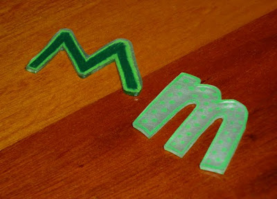
> I've been tending my niece and nephews the last couple days. Before coming, I searched with my sister to find a fun activity to do with them, and we ran across a blast from the past...Shrinky-Dinks! We have fond memories of them from our childhoods. I didn't even know you could still find them! 

> The kids love to draw, so we had fun creating and coloring on the special plastic sheets, then the real fun began...we placed the cutout shapes in the oven and watched as they curled, shrunk to one-third their original size, thickened up, then finally lay flat.
> We all made lots of fun creations, and they have all talked about what they will draw next time I come and bring more of the special magic plastic.

Tuesday, February 2, 2010

me or we?

> I've been working on updating my web site. I wrote all the text, edited, and edited, asked others to edit, then finally decided it was "ready". But as I was placing it into the site's content management system, I ran across an inconsistency that needed fixing. The problem is that I'm not really sure where I "land" on this particular issue: Is mGraphicDesign a "me", or a "we"?
> mGraphicDesign is a one-person business. I'm okay with that, in fact I prefer it. But when I'm trying to get new business, sometimes there are reservations about hiring a "freelancer". I've been told it's better to appear larger, more experienced, and more substantial—that somehow size "proves" capability. One of my colleagues (also a sole proprietor) once pointed out to me that we don't literally work solo, so why not refer to the company as "we"? He's right. When I'm designing a web site, I hire skilled programmers who handle that part of the project. If I'm working on a brochure, the photos may come from the client, they may come from an online stock source, or I may hire a photographer to do custom work. Same goes for printing. In fact, there have been many times when my workload has been heavy enough that I hire freelancers to share my load. So in that sense, mGraphicDesign is a "we".
> So how will I handle the correct pronoun usage on my site? Good question! Right now I'm working on making sure the portfolio section of my web site is as impressive as it can be, showing a wide variety or projects, for a diverse clientele, and if I can get that right, maybe "we" and "me" will be okay either way.

Thursday, January 14, 2010

spring cleaning

> I went to my parents' house a couple weeks ago. They've been spending a lot of time going through files, boxes and shelves, getting rid of things that they have decided they can't justify keeping anymore. I have to admit there is something very free-ing about going through and trashing stuff you just don't need anymore.
> I subscribe to a couple different trade publications. They're perfect-bound, content and image-rich, and are more like books than magazines, so it's easy to justify keeping them. For awhile, I kept them all, but before a move one time, I took the time to thumb through some of the older issues, and found that technology had changed so dramatically in the couple of years since the issue was published, that I was able to throw away several older copies.
> I can always tell when it's time to go through and decide what to keep and what to trash. I finished reading an issue I received in last week's mail and there is no more room on my shelf...that's a sure sign that something's gotta go.

Wednesday, January 6, 2010

love it? hate it? it's okay

> An unidentified woman recently gave my client an unsolicited "review" of his "Live in Art" logo. She told him that she didn't like it, that it was no good. She wasn't able to articulate what she thought was so bad about it, but somehow, she felt justified in sharing her opinion with him (we couldn't figure out how it was relevant, or why she was so emboldened as to approach a total stranger, in an attempt to insult something that he obviously liked).
> He called me to laugh about it with him. Yep, I designed it. I've been doing design work for him for over 15 yrs, and I'm pretty sure if he shared her opinion, we wouldn't have that history.
> I wasn't offended though. One person may like bright colors and a busy layout with lots going on. Another person may be attracted to muted, earthy colors, in a simple layout. There's nothing inherently "wrong" about either one—just a matter of taste, opinion, and knowing what's appropriate for the target audience.
> While I happen to like the design (yes, I'm biased), it's more important that my client likes the design. It's been working well for him for several years now, and he'll tell me when it's not working for him anymore. That's the opinion that matters to me.